
Here’s a guide to help you understand what works and what doesn’t when it comes to very small rubber stamps and loyalty card stamps. As a rule of thumb, you want the design to be as simple as possible. So, for best results you want a simple drawing or a few letters such as the abbreviated initials of your business.
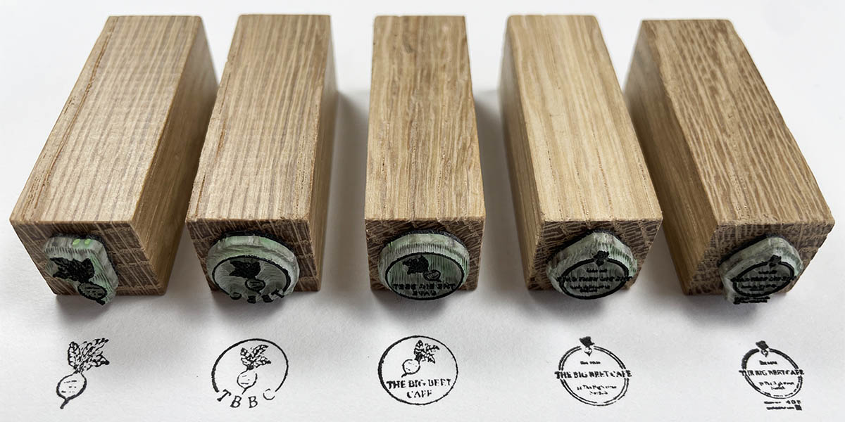
Here you can see loyalty card rubber stamp designs for a fictional café with increasing levels of complexity. The first two are simple designs and should work perfectly. The branding comes across well with just the logo design of the beetroot or the beetroot along with the initials of the business. The lettering in this second example is small but we should find it prints well and is easily readable. When creating a design for a loyalty card stamp you basically want to make the lettering as big as possible.

The middle design should be recognisable as the logo of the business when shrunk down to a 1cm stamp, but the smaller text won’t be readable. If it is vital that the text is all readable on your loyalty stamp don’t upload a design with this much detail. It is recognisable as the logo though, which is enough for some people, so if that sort of loss of detail isn’t an issue for you, feel free to order with this sort of design.

The fourth and fifth stamp designs are where they start to get too detailed and so if your Loyalty card stamp design is similar to these then we would recommend you try to simplify your design if you can. With the fourth design you should still get the essence of the logo and thus it could still work well for a loyalty card rubber stamp even though the details of the design don’t come through. So, we would make the stamp with this artwork for a loyalty card stamp.
As for the fifth design, we would not make this and would reach out to you asking for an updated/simpler design. At this level of complexity It will look like a bit of a mess shrunk down to a 1cm sized stamp. There’s also additional information including a QR code that won’t work and as it’s not a part of the core logo design it may as well be removed.

So, here’s the results. On the large part you can see that our predictions for the five small rubber stamps are more or less spot on. The main take away here when thinking of a design for a loyalty card stamp is to make it as simple as possible. If you want to use your logo as it is then go ahead but be aware that while everything may not be readable shrunk down to 1cm, your branding will come through and your miniature logo will look awesome when stamped on your customers loyalty cards.


